13 December 2012

Diffusivity Profiles and α-Effect

So yesterday (12 December 2012) I reverse engineered enough FORTRAN syntax to have SURYA output the information for the α-effect, toroidal diffusivity, and poloidal diffusivity profiles. Each of these is calculated once and is not updated subsequently, so a very short run was all that was needed to get the relevant info.

There is a prepackaged plotting routine for the α-effect profile at a given colatitude/latitude, which I rediscovered while writing plotting routines for the diffusivity profiles. I have yet to go through it and figure out exactly how it works, and I may just decide to write another one. Its output looks like this (after scaling the horizontal axis and adding some axis labels):

α-effect profile, near the pole (according to the output).
The plotting routine I did "write" displays the α-effect on a meridional slab:
To be fair, by "write" I mean, "I realized that since these profiles aren't updated in time, just like the differential rotation, I could just hijack that plotting routine." That having been said, here's what the poloidal and toroidal diffusivity profiles look like (note, I did not rescale the values to physical units):


Which I suppose is all well and good, but the diffusivities don't vary as functions of θ. That means that, pretty though those plots may be, you really only need to see them as functions of radius (the values have been rescaled to physical units here):

So what have we learned? While making pretty plots is fun, sometimes it's unnecessary. Some of those times are when things only vary in one dimension.

07 December 2012

Some SURYA Output Plots

One of the subroutines that came with SURYA rescales the axes so that 1 unit on the horizontal axis takes up the same amount of physical space as 1 unit on the vertical axis (in other words: it makes a circle look like a circle) and draws some bounding semi-circles to represent a meridional slab. Some small adjustments needed to be made, as some runs were done with a proportional star of radius 0.92*R.

Another change I made was to use the dlmread command instead of the load command. This uses less RAM so larger data sets can be analyzed.

I'm not going to go into more detail about the changes I've made here.

Here are five of the plots that can be obtained with the output from a run of SURYA. This run lasted for 50 time units, which corresponds to about 150 years.

The differential rotation profile. This is calculated before the run begins. I need to look into this particular profile, as if this is rotation rate in nHz, then the equator has about a 41 day rotation period. This may have something to do with the slightly smaller star that the meridional slab was drawing.

I happen to think this plot looks better as a pcolor rather than a contour plot.


The stream function, as a contour plot and as a pcolor:


The poloidal field at the end of the run, again as a contour plot and as a pcolor. It is produced from the third column of "final.dat".


 The time evolution of the radial field at the surface:
Finally, a butterfly diagram (time evolution of the toroidal field) at the bottom of the convection zone (r = 0.7*R). It is produced from reading in "butbot.dat".


For next time, I want to see if I can pin down what's going on with the differential rotation profile, and copy enough FORTRAN to get the poloidal and toroidal diffusivity profiles to print to a .dat file. There's also a way to plot the meridional circulation without the contours of the stream function. Most importantly, I need a way to determine the period of the cycles. There's always a Fourier transform, but I'm looking into using the autocorr function instead.

06 December 2012

How to Make a Labeled Contour Plot in MATLAB

So in my last post I promised to do a walk-through of how I made a contour plot of the function z = 6*x*y - 5*x2 using MATLAB. Here's a copy of that plot:

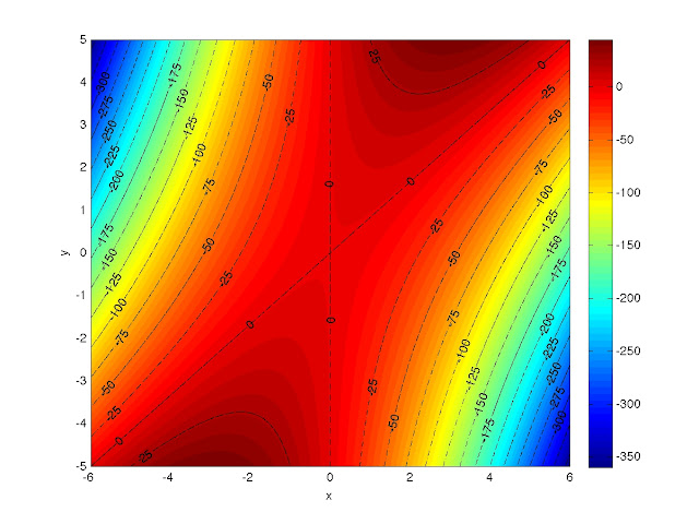
Contour plot of z = 6*x*y - 5*x2.


This will provide some illustration of some of the more abstract commands I mentioned in the last post, so let's get started. Remember: the semicolon character ( ; ) at the end of an expression will suppress the output from that line. If you accidentally do this for a plot command, it'll still show up though.

If you've been playing around in MATLAB already and you want to start from an empty workspace, type in the command clear. You should notice that any workspace variables you had have magically vanished. If you want to clear out a specific quantity, type "clear quantity." Also, if you're following along and trying this yourself, realize that MATLAB is pretty forgiving with whitespace inside an expression, an argument to a command, or inside colon notation, so sometimes I add extra space to make things readable, sometimes I don't.

The first thing we need to do is make the coordinate grid. When I did this step for the previous post, I used colon notation:

X = -6:0.01:6;
Y = -5:0.01:5;

which produced two arrays: X, which is a 1201-element row vector from -6 to 6 in increments of 0.01; and Y, which is a 1001-element row vector from -5 to 5 in increments of 0.01. I know I haven't mentioned it yet, so let me say that if you don't give a middle argument in an expression that uses colon notation, it'll automatically increment by 1 between the two arguments. If the two bounding values aren't an integral multiple of the increment apart, the resulting array will not exceed the upper bound.

Since I know how many elements are in each vector, I can easily produce the same arrays using linspace:

X = linspace(-6,6,1201);
Y = linspace(-5,5,1001);

Just for fun, I made Y with colon notation and then Ybar with linspace and then calculated the element-by-element difference between the two. The absolute values of the differences between corresponding elements ranged from 0 to about 9 x 10-16.


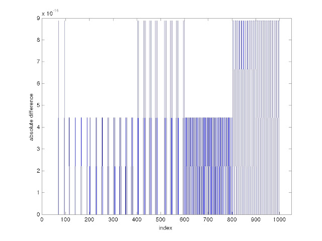
The absolute values of the differences between corresponding elements of two arrays, one made with colon notation and the other made with a linspace command.

When I first made that graph, the horizontal axis went out to 1200. I decided to cut it down, since 1200 is close to number of indices in my X array and I didn't want it to be ambiguous. You can specify a viewing window with the axis command:

axis([horizontal_min horizontal_max vertical_min vertical_max]).

You'll have to specify the values of horizontal_min, horizontal_max, and their vertical counterparts.

Getting back to making the contour plot, now we need to make the coordinate grid, which I do with the meshgrid command.

[x,y] = meshgrid(X,Y);

and calculate the function:

z = 6*x.*y - 5*x.^2;

When using arrays, the period before an operator tells MATLAB to go element-by-element. This way, x.*y means x_11*y_11, x_12*y_12, etc. and x.^2 means (x_11)^2, (x_12)^2, and so on.

We're ready to plot now, so let's make a pcolor plot--the default is faceted shading:


What happened? Faceted shading prints the grid, but the grid points are so close together you can't see the function. If you click on the zoom-in button on the top of the figure window and define a viewing window small enough, you can see some of the colorized plot. Typing "axis('auto')" will get you back to the default viewing window, or you can use the zoom-out button. Flat shading comes next, and you can get that by typing "shading('flat')". In general, it will look like a coarse version of what you'll get by typing "shading('interp')" for interpolated shading, but, personally, I can't see a big difference for this example. I'll just show you the interpolated shading.

The axes aren't labeled. You will find fewer things irritate a scientist more than showing them a plot with unlabeled axes. Regardless of what it is you've plotted, or how you're referring to the axes, you label the horizontal and vertical axes, respectively, with the following commands:

xlabel('horizontal_axis_label')
ylabel('vertical_axis_label')

I'm just going to call the axes x and y.

xlabel('x')
ylabel('y')

Let's add a color bar so we have some scale for the function. The command is colorbar (some things are straightforward).

Right now things should look like this:


If you want to see the plot in grayscale, use the command colormap. Type in "colormap(gray)" and you'll get the following. You must spell it "gray". If you use the word "grey", it will generate an error.

To get back to the old colormap, type "colormap('default')". If you didn't notice, in the commands the word "default" had single quotes around it, but "gray" didn't.  By the way, I got most of the information for grayscale that I wanted with a Google search that pointed me to a webpage made by MATLAB's parent company. Like I said, the help pages aren't always as useful as you'd like them to be. Just in case it wasn't clear, I'm going to switch back to the default colormap.

Now we're ready to draw some  contours. If you want to represent different categories with different colors and/or line styles, you should decide what the categories are before proceeding. You could probably change your mind in the middle, but I find that things are generally easier if you know what you want beforehand. I want two categories: contours down to z = -150, which I'll used black, dashed-dotted lines for and contours below z = -150, for which I'll use black, dashed lines. In both cases, I plan on incrementing by 25 and, because I already drew a color bar, I have an idea about the range I need to cover for both categories. The following commands will generate the vectors whose elements indicate where I want contours drawn.

dashdots = -150:25:50;
dashes = -400:25:-175;

Turn the hold command on by typing "hold on".

You need to assign a handle if you want to label the contours; it doesn't matter what it's called. The handles are taken care of by the things on the left hand side of the equals sign. The right hand side takes  care of drawing the contours at the specified levels and the line styles and colors (see "help plot" for line styles and colors). If you know that you don't want to label the contours, you can just type in the commands on the right hand side of the equals sign.

[b,g] = contour(x,y,z, [dashdots], 'k-.');
[c,h] = contour(x,y,z, [dashes], 'k--');

I advise using the semicolons after the commands or MATLAB will echo the values of b, c, g, and h to the screen. After the first command, the dashed-dotted lines closer to the plot center should have appeared and the dashed lines should have shown up after the second command. The plot should look like this:

And now we add labels withe the clabel command.

clabel(b,g);
clabel(c,h);

And now your plot should look like what I promised:

And now, to save as the highest possible quality jpeg:

print -djpeg labeled_contours

Whatever directory MATLAB is currently working in, that command should leave a file there.

So that does it. If you're using this to make a labeled contour plot, I hope you found it useful. The whole point of writing it the way I did was so that I could reread this post and be able to do it in a few minutes. In the next post I'll start showing some of the plots that can be generated from the SURYA output files.


05 December 2012

Some MATLAB Basics and a little SURYA

I started working on this post about a month ago, but then proceeded to get side-tracked. I've been advised to write posts that contain less text, but this one was mostly written already, so I decided to finish it as is. Subsequent posts will more than likely contain less text.

--------------------------------------------------------------------------------------------------------------------------------

So I started delving into SURYA by actually reading the first few sections of the users' guide. Some things I've learned so far:


  • The code can run from a specified initial state if the variable "irelax" is set to 1 and a file "init.dat,"  which can be a renamed final.dat from a previous run, is provided. If irelax is set to 0, the code runs after generating its own initial state.


  • The code runs in a region divided into a grid of r, θ values. By default this grid is 129-by-129. The region is given by 0.55 < r/R < 1 and 0 < θ < π. This means the step sizes between grid points are (3.48837x10⁻³)*R and π/129. Note that since we're working on (half of) a 2-D slice of a sphere, the further out from the center we are, the larger the area taken up by a grid block.


  • The code runs in length units of 1010 cm  (so R = 6.96), and time units of 108 sec (so 1 yr = 0.315).


At this point I think I've introduced enough of the code to start talking about some of the output files. Let's start with "run.dat." This file has 6 columns, and sorting through the code and the handy table of how quantities are represented (in the users' guide) one can determine that, respectively, columns 1 through 6 are time (in code units), B(r = 0.707R, θ = 74π/129), B(0.703R, 74π/129), B(0.707R, 54π/129), A(0.969R, 122π/129), and A(0.969R, 6π/129). I've been told that the units on B are 105 G, but I haven't seen this stated explicitly in the documentation or the code yet. These are the toroidal field at the bottom of the convection zone and a little ways south of the equator; toroidal field in the tachocline, again a little south of the equator; toroidal field at the bottom of the convection zone, just north of the equator (about as far north as the previous two values were south); the poloidal field just under the photosphere, close to the south pole; the poloidal field just under the photosphere, close to the north pole.

Another output file is "final.dat" This file has 4 columns: θ, r, A(r,θ)*r*sin(θ), and B(r,θ). Contours of column 3 yield the distribution of the poloidal field, and repeating the process with column 4 gives you the toroidal field.

Included with the code were some prepackaged MATLAB files that generate plots of various quantities. Most of these have names that suggest what quantity they plot, and they do so by reading in a .dat file, extracting the relevant columns, passing the necessary information to a similarly-named file (foo.m talks to fooplot.m) which makes regularly-spaced grids and/or pretty axes and specifies the type of plot (usually latitude vs. time or an r-θ plot). Some of this functionality I was already familiar with, but that was frequently not the case. Why is that?

In addition to learning the ins and outs of SURYA, I also face the problem of having little facility (in my opinion) with MATLAB. I'm going to attempt to cement some of the knowledge I've acquired recently, rather than just finding what I need when I need it and always referring to that instance when I need to perform a similar task. Unfortunately for the reader, that means I'm going to start explaining things as I understand them.

I promised to provide you guys with pictures, but I've been busy talking about how the pictures will be made instead of just, you know, putting them in. Seriously, they're coming.

Before I say anything else, let me introduce the help command. Typing "help nuisancecommand" will bring up a whole bunch of info about the command "nuisancecommand," including its syntax. I find how useful this is will vary from command to command. There is usually a link to the topic in the help browser at the bottom of the help entry, and I find this varies in usefulness as well. If neither of these is helping (and you've already tried a google search that didn't help either), your best bet is to try using the command on some non-crucial, trial arguments until you feel you understand its behavior. In fact, you should probably do that anyway.

I'm going to explain some array size commands so that I don't have to break up whatever flow might accidentally end up existing in the text later: Let's use a 1-by-n array (an n-element row vector), X, an m-by-1, array (an m-element column vector), Y, and an m-by-n array (a matrix or 2nd rank tensor) T.

  • size: will return the number of rows and the number of columns. The command size(X) would return [1 n], size(Y) would return [m 1] and size(T) would return [m n].
  • numel: will return the number of elements in an array (the number of rows multiplied by the number of columns). The command numel(T) would return the number m*n, even if one of the elements is 0.
  • length: will return the larger of the dimensions: it is basically max(size( )). I assume you can infer what the max( ) command does. The command length(T) will return the larger of m and n.
The command meshgrid will create a grid of points based on the arguments you give it. For example, lets say:

[u,v] = meshgrid(a,b).

For my purposes, a and b will be row vectors with different dimensions. What this command does is produce two matrices, u and v. The matrix u has numel(b) rows, all of which are the vector a. The dimensions of u are numel(b)-by-numel(a). The matrix v has numel(a) columns, all of which are the transpose of the vector b. The dimensions of v are numel(a)-by-numel(b). If you need to make the vectors a and b between some given boundaries and know how many data points you need the boundaries, the linspace command will probably come in handy:

linspace(c,d) will return a vector of 100 evenly spaced points between the numbers c and d.
linspace(c,d,n) will return a vector of n evenly spaced points between the number c and d.

Either of those things could be accomplished with colon notation (type "help colon"), but linspace might be easier in some instances.

The reshape command takes a given array and rearranges it into an array with the given dimensions:

q = reshape(xi,M,N) will take the array "xi" and produce an array that is M rows-by-N columns. The first column will be the first M entries of xi, the second column will be the second M entries, and so on. MATLAB refers to this as taking the elements of xi "columnwise."

Before I forget to mention them, here are some basic plotting commands and functionality:

  • The command hold on will tell MATLAB that it should draw whatever you ask for next on top of the figure in which you are currently working. The command hold off will turn this behavior off.
  • The command figure() (or just figure) will open a new plot figure. Typing figure(k) will tell MATLAB that the next series of commands should affect figure k--sometimes I find this easier than trying to find the figure I want and give it window focus when I have multiple figures open. If you're looking at a figure window and just start typing, MATLAB will shift focus back to the command window, so at least you don't have to find the right figure and then find the command window again.


The pcolor command creates a "checkerboard" plot based on the inputs it is given. With matrices x and y and a resultant function of x and y, z ( z = f(x,y) ):

pcolor(x,y,z)

will basically meshgrid x and y and plot a colored surface to represent the value of z. The resulting plot will have obvious grids and is an example of shading('faceted'). Typing in shading('flat') will remove the grids and shading('interp') will blend the coloring a little better by averaging values from the surrounding grid points at a given location (all this is covered in the help entry). Typing colorbar will place a colorbar outside and to the right of the plot. Ways to change the default positioning are covered in the help for colorbar.

Similar to pcolor is the surface command, but surface allows specification of a viewing angle, while pcolor is from directly overhead.

Also similar to pcolor is the contour command, but it only draws contours at levels that can be chosen automatically by MATLAB:

contour(x,y,z)

or by the user, let's say at values of z that correspond to the entries in the vector c:

contour(x,y,z,[c]).

An arbitrary two-element vector that receives the output from contour(x,y,z,[c]) can be used to label the contours. I'm going to use a semicolon on the first line this time--it suppresses the output:

[stuff1, stuff2] = contour(x,y,z,[c]);
clabel(stuff1, stuff2)

If you use the hold commands I mentioned before and play with the line coloring/style options (type "help plot"), you can get things that look like this:

Here's a contour plot of z = 6*x*y - 5*x2. The contours are evenly spaced at multiples of 25 and contours down to -150 are shown with dashed-dotted lines. Contours below -150 are shown with dashed lines. I'll walk you through how I made this plot in the next entry.


Now, how did I get the picture out of MATLAB? MATLAB will save images (and probably other things) using the command print.

print -depsc 'filename.eps'

The "-depsc" is a flag that says save as a color (the "c") eps file (the "eps")--the ".eps" I put on the end of the filename isn't necessary. I also didn't need the single quotes around "filename.eps". To clarify

print -depsc filename

would have produced the same output.

The "d" part of the flag seems to be compulsory. The file will be saved as "filename.eps" in whatever directory MATLAB is currently working. You could change that by throwing around some UNIX file tree stuff beforehand. For example,  ~/matlab_plots/filename.eps would put filename.eps into a directory matlab_plots. The directory matlab_plots would be a subdirectory of the user's home directory. I'm not planning on explaining any more "basic" UNIX than I just did. Some other flags are -dtiff, which saves as a .tiff, -dpng, which saves as a .png, -dps, which saves as a .ps, -djpeg (I assume you've noticed the pattern). The -djpeg flag can take a numerical argument right after it that specifies the quality of the file. A 0% quality file looks like this:
A reproduction of z = 6*x*y - 5*xat the poorest quality possible.

and a 100% quality file looks like this:
A reproduction of z = 6*x*y - 5*x2 at the highest quality possible.

Those two plots are pcolor's of the example function I used for the contour plot. They were saved with the commands

print -djpeg0 crappy_example

and

print -djpeg100 full_example


One command that I came across while looking up things for this post is subplot. It looks like it will be VERY useful in the future, but I have yet to read through its help file or start experimenting with it. I find that what helps me most is knowing that a command that does what I'm trying to do already exists. At the very least, it'll save me some time doing a Google search. Another time, subplot, another time.

As I mentioned in the caption for the first picture, I plan on doing a walk-through of how I made the contour plot for the next blog entry. It'll probably have the same style as this entry, as they were originally meant to be the same post, but this one is turning into a mammoth already.

After that, the plan is for a post that shows the output from the plot routines that came along with SURYA and thereafter things will probably take on a "look what I did" as opposed to "look how I did this" feeling.

26 October 2012

The Inaugural Post

So I guess this is a thing now.

Right now the plan is to spend part of the weekend getting better acquainted with some MATLAB commands, and getting acquainted with SURYA in general. If for some reason you have to read this blog, you'll get to suffer through that along with me, complete with pictures.

EDIT: While I'm at it, I should probably figure out why it is the time stamp corresponds to roughly Pacific time when I'm currently in India.