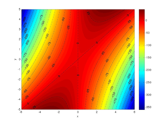
So in my last post I promised to do a walk-through of how I made a contour plot of the function z = 6*x*y - 5*x2 using MATLAB. Here's a copy of that plot:
 |
| Contour plot of z = 6*x*y - 5*x2. |
This will provide some illustration of some of the more abstract commands I mentioned in the last post, so let's get started. Remember: the semicolon character ( ; ) at the end of an expression will suppress the output from that line. If you accidentally do this for a plot command, it'll still show up though.
If you've been playing around in MATLAB already and you want to start from an empty workspace, type in the command clear. You should notice that any workspace variables you had have magically vanished. If you want to clear out a specific quantity, type "clear quantity." Also, if you're following along and trying this yourself, realize that MATLAB is pretty forgiving with whitespace inside an expression, an argument to a command, or inside colon notation, so sometimes I add extra space to make things readable, sometimes I don't.
The first thing we need to do is make the coordinate grid. When I did this step for the previous post, I used colon notation:
X = -6:0.01:6;
Y = -5:0.01:5;
which produced two arrays: X, which is a 1201-element row vector from -6 to 6 in increments of 0.01; and Y, which is a 1001-element row vector from -5 to 5 in increments of 0.01. I know I haven't mentioned it yet, so let me say that if you don't give a middle argument in an expression that uses colon notation, it'll automatically increment by 1 between the two arguments. If the two bounding values aren't an integral multiple of the increment apart, the resulting array will not exceed the upper bound.
Since I know how many elements are in each vector, I can easily produce the same arrays using linspace:
X = linspace(-6,6,1201);
Y = linspace(-5,5,1001);
Just for fun, I made Y with colon notation and then Ybar with linspace and then calculated the element-by-element difference between the two. The absolute values of the differences between corresponding elements ranged from 0 to about 9 x 10-16.
 | |
|
axis([horizontal_min horizontal_max vertical_min vertical_max]).
You'll have to specify the values of horizontal_min, horizontal_max, and their vertical counterparts.
Getting back to making the contour plot, now we need to make the coordinate grid, which I do with the meshgrid command.
[x,y] = meshgrid(X,Y);
and calculate the function:
z = 6*x.*y - 5*x.^2;
When using arrays, the period before an operator tells MATLAB to go element-by-element. This way, x.*y means x_11*y_11, x_12*y_12, etc. and x.^2 means (x_11)^2, (x_12)^2, and so on.
We're ready to plot now, so let's make a pcolor plot--the default is faceted shading:


xlabel('horizontal_axis_label')
ylabel('vertical_axis_label')
I'm just going to call the axes x and y.
xlabel('x')
ylabel('y')
Let's add a color bar so we have some scale for the function. The command is colorbar (some things are straightforward).
Right now things should look like this:


Now we're ready to draw some contours. If you want to represent different categories with different colors and/or line styles, you should decide what the categories are before proceeding. You could probably change your mind in the middle, but I find that things are generally easier if you know what you want beforehand. I want two categories: contours down to z = -150, which I'll used black, dashed-dotted lines for and contours below z = -150, for which I'll use black, dashed lines. In both cases, I plan on incrementing by 25 and, because I already drew a color bar, I have an idea about the range I need to cover for both categories. The following commands will generate the vectors whose elements indicate where I want contours drawn.
dashdots = -150:25:50;
dashes = -400:25:-175;
Turn the hold command on by typing "hold on".
You need to assign a handle if you want to label the contours; it doesn't matter what it's called. The handles are taken care of by the things on the left hand side of the equals sign. The right hand side takes care of drawing the contours at the specified levels and the line styles and colors (see "help plot" for line styles and colors). If you know that you don't want to label the contours, you can just type in the commands on the right hand side of the equals sign.
[b,g] = contour(x,y,z, [dashdots], 'k-.');
[c,h] = contour(x,y,z, [dashes], 'k--');
I advise using the semicolons after the commands or MATLAB will echo the values of b, c, g, and h to the screen. After the first command, the dashed-dotted lines closer to the plot center should have appeared and the dashed lines should have shown up after the second command. The plot should look like this:

clabel(b,g);
clabel(c,h);
And now your plot should look like what I promised:
print -djpeg labeled_contours
Whatever directory MATLAB is currently working in, that command should leave a file there.
So that does it. If you're using this to make a labeled contour plot, I hope you found it useful. The whole point of writing it the way I did was so that I could reread this post and be able to do it in a few minutes. In the next post I'll start showing some of the plots that can be generated from the SURYA output files.
Thanks!
ReplyDeleteHi!
ReplyDeleteI am trying to obtain a similar plot and I am having some troubles.
I have a .dat file with three columns: two for the plan coordinates (x and y),
and one for the elevation values (z-axis), all of the same size (15000x1).
Is it possible to create a plot like this? I can create a meshgrid with my x and y values, but then I can't express mathematically the coordinate z with the plan coordinates. Can anyone help me?
Thank you very much in advance!